WhatsApp Chat

June 8, 2024

Web-development-coding

The Future of Angular: Trends and Innovations in Development Services

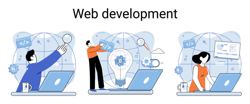
In the dynamic world of web development, Angular has established itself as a cornerstone framework for building robust and scalable applications. As the digital landscape continues to evolve, so does Angular, adapting to new trends and embracing innovations that shape its future. This blog explores the latest trends and innovations in Angular development services, providing insights into what lies ahead for this powerful framework. The Evolution of Angular Angular, originally developed by Google in 2010, has come a long way since its inception. From its early days as AngularJS, the framework has undergone significant transformations, culminating in the modern Angular we know today. With regular updates and a strong focus on improving performance and developer experience, Angular remains at the forefront of web development technologies. Key Trends Shaping the Future of Angular Enhanced Performance with Ivy One of the most significant innovations in Angular is the Ivy rendering engine. Introduced in Angular 9, Ivy offers improved performance, smaller bundle sizes, and better debugging capabilities. Its ability to compile components independently paves the way for faster and more efficient applications. As Ivy continues to evolve, we can expect even greater performance optimizations and enhancements in future Angular releases. Server-Side Rendering (SSR) and Angular Universal With the growing demand for faster load times and better SEO, server-side rendering has become a crucial aspect of modern web development. Angular Universal enables developers to render Angular applications on the server, resulting in faster initial load times and improved search engine visibility. The future of Angular will likely see further improvements in SSR capabilities, making it easier to build high-performance, SEO-friendly applications. Progressive Web Applications (PWAs) Progressive Web Applications (PWAs) are transforming the way users interact with web applications, offering native app-like experiences directly in the browser. Angular provides robust support for building PWAs, allowing developers to create offline-capable, highly responsive applications. As PWAs gain traction, Angular’s PWA support will continue to be a key focus, with new features and enhancements making it easier to build cutting-edge web applications. Component-Driven Development The trend towards component-driven development is reshaping the way applications are built. Angular’s modular architecture, combined with its powerful component-based approach, allows developers to create reusable and maintainable code. The future will see an even stronger emphasis on component-driven development, with tools and libraries designed to streamline the creation and management of components. Improved Tooling and Developer Experience Angular’s commitment to improving developer experience is evident in its extensive suite of tools and features. The Angular CLI, Angular Console, and other development tools simplify common tasks and enhance productivity. Future innovations will likely focus on further streamlining the development process, offering enhanced debugging, testing, and build capabilities. Innovations to Watch For Machine Learning and AI Integration As machine learning and artificial intelligence become more prevalent, integrating these technologies into Angular applications will open new possibilities. Future versions of Angular may include built-in support for ML and AI frameworks, making it easier to incorporate intelligent features into web applications. Advanced State Management Solutions Managing state in complex applications can be challenging. While Angular provides powerful state management libraries like NgRx, the future may bring more advanced and user-friendly solutions for state management. These innovations will simplify the process of handling application state, making it more intuitive and efficient. Enhanced Accessibility Features Accessibility is a crucial aspect of modern web development. Angular’s commitment to accessibility will likely result in new features and improvements that make it easier to build inclusive applications. Developers can expect enhanced tools and guidelines for creating accessible user interfaces. GraphQL Integration GraphQL is revolutionizing the way data is fetched and managed in web applications. Future Angular versions may offer seamless integration with GraphQL, providing developers with powerful tools for efficient data querying and manipulation. Conclusion The future of Angular is bright, with ongoing trends and innovations promising to enhance its capabilities and solidify its position as a leading web development framework. From performance optimizations with Ivy to the rise of PWAs and advanced tooling, Angular is poised to meet the demands of modern web development. By staying abreast of these trends and embracing new innovations, developers can leverage Angular to build high-quality, future-proof applications that deliver exceptional user experiences.

The Future of Angular: Trends and Innovations in Development Services Read More »

mobile-app-developer-icon

The Impact of Mobile-First Design on Web Development Services

In today’s digital era, mobile devices have become an integral part of our daily lives. As more people access the internet via smartphones and tablets, the approach to web development services has evolved significantly. Mobile-first design has emerged as a crucial strategy, shaping how websites are developed to ensure optimal user experience on mobile devices. Understanding Mobile-First Design What is Mobile-First Design? Mobile-first design is a web development approach where the design process starts with the mobile version of a website and then scales up to larger screens, such as tablets and desktops. This strategy prioritizes the mobile user experience, ensuring that websites are functional, fast, and user-friendly on smaller screens. Why Mobile-First? The mobile-first approach is driven by the increasing dominance of mobile internet usage. According to Statista, mobile devices accounted for over 54% of global web traffic in 2021. This trend underscores the need for websites to be optimized for mobile users, who demand fast-loading pages, easy navigation, and responsive layouts. The Benefits of Mobile-First Design Inhanced User Experience Mobile-first design ensures that websites are intuitive and accessible on mobile devices, offering a seamless user experience. This approach prioritizes essential content and functionality, reducing clutter and focusing on what matters most to users. As a result, users can easily navigate and interact with the website, leading to higher engagement and satisfaction. Improved Performance Websites designed with a mobile-first approach tend to load faster on mobile devices. By starting with a lightweight, streamlined version of the site, developers can optimize performance and minimize load times. This is crucial for mobile users, who often rely on slower network connections compared to desktop users. Faster load times also contribute to better search engine rankings, as page speed is a key factor in Google’s ranking algorithm. Greater Reach and Accessibility A mobile-first approach ensures that websites are accessible to a broader audience. With billions of people using mobile devices to access the internet, optimizing for mobile ensures that your website can reach and engage this vast user base. Additionally, mobile-first design often leads to better accessibility for users with disabilities, as it encourages the use of best practices in responsive design and user interface (UI) simplicity. Implementation Strategies for Mobile-First Design Prioritize Content In a mobile-first approach, content prioritization is key. Start by identifying the most critical content and features that users need on mobile devices. This might include essential information, navigation elements, and call-to-action buttons. By focusing on the core content first, you can create a clean and efficient mobile experience. Use Responsive Design Techniques Responsive design techniques ensure that your website adapts to various screen sizes and orientations. This involves using flexible grids, fluid images, and CSS media queries to create a layout that adjusts seamlessly from mobile to desktop. By incorporating responsive design, you can provide a consistent and optimal user experience across all devices. Optimize Performance Performance optimization is crucial for mobile-first design. Techniques such as lazy loading, minification of CSS and JavaScript files, and optimizing images can significantly improve load times. Additionally, leveraging modern technologies like Accelerated Mobile Pages (AMP) can further enhance mobile performance. Test Across Devices Thorough testing is essential to ensure a flawless mobile experience. Test your website on a variety of mobile devices and browsers to identify and address any issues. Tools like Google’s Mobile-Friendly Test and browser developer tools can help you evaluate and optimize your site’s mobile performance. The Future of Mobile-First Design Progressive Web Apps (PWAs) Progressive Web Apps combine the best of web and mobile app experiences, offering fast, reliable, and engaging user experiences. PWAs are designed with a mobile-first approach, providing features like offline access, push notifications, and home screen installation. As PWAs gain popularity, they represent a natural progression for Mobile App Development Company, further blurring the lines between web and native mobile apps. Voice Search and AI Integration With the rise of voice-activated devices and AI-driven interactions, mobile-first design will increasingly incorporate voice search optimization and AI integration. This involves designing websites that are easily navigable via voice commands and leveraging AI to provide personalized and context-aware experiences. Enhanced Mobile Commerce Mobile commerce (m-commerce) is growing rapidly, with more consumers making purchases via mobile devices. Mobile-first design will continue to drive innovations in m-commerce, focusing on streamlined checkout processes, secure payment options, and personalized shopping experiences. Conclusion Mobile-first design has fundamentally transformed web development services, prioritizing the mobile user experience and driving innovations in performance, accessibility, and engagement. By adopting a mobile-first approach, businesses like Aspire Software Consultancy can create websites that meet the needs of today’s mobile-centric users, ensuring they remain competitive in an ever-evolving digital landscape. As technology continues to advance, mobile-first design will undoubtedly play a crucial role in shaping the future of web development, paving the way for more intuitive, efficient, and inclusive online experiences.

The Impact of Mobile-First Design on Web Development Services Read More »

Scroll to Top